Champion & Nash Law Group Marketing Mix Review
A marketing mix review of Champion & Nash Law Group evaluating its website, SEO strategy, social presence, and branding. This review compares the firm to competing personal injury law firms and outlines high-impact, low-effort opportunities to improve visibility, trust, and client conversion.
8/22/20253 min read
Mix With Marketing is a marketing blog that reviews how companies execute their marketing across the channels that most directly influence visibility, trust, and conversion. Each review evaluates a real business using a consistent grading framework across Website, SEO, Social, and Branding, and scores performance relative to competitors operating in the same space.
Rather than offering generalized marketing advice, Mix With Marketing focuses on practical analysis. We look at how clearly a company presents its services, how easily potential customers can understand and trust the business, and how effectively the marketing supports real-world business goals.
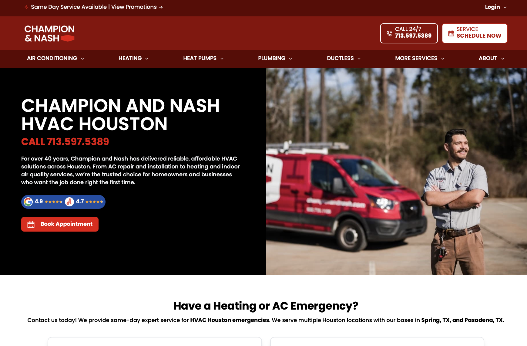
In this review, we analyze Champion & Nash Law Group (https://championandnash.com/), a personal injury law firm representing clients in civil litigation matters. As a firm operating in a highly competitive and trust-driven legal category, its marketing must establish credibility quickly, communicate authority, and make it easy for prospective clients to take action.
For comparison, this review benchmarks Champion & Nash Law Group against two competitors in the personal injury law space:
Morgan & Morgan
Cellino Law
These firms represent large-scale authority marketing and strong regional brand recognition, respectively.
Website — B
What’s Great
The website immediately communicates that the firm focuses on personal injury law, reducing confusion for first-time visitors who may be unfamiliar with legal categories
Messaging emphasizes advocacy, representation, and client support, which aligns well with expectations in personal injury cases
Navigation is simple and intuitive, allowing users to locate practice areas, firm information, and contact options without friction
Contact pathways and consultation prompts are clearly visible across the site
The overall design conveys professionalism and seriousness, reinforcing trust
What Needs Work
Messaging relies heavily on commonly used personal injury language, which can make the firm feel less distinct from competitors
Visual hierarchy does not strongly guide users toward the most important information or next steps
Some pages contain dense text blocks that reduce scannability, especially on mobile devices
Trust indicators such as testimonials, settlements, or case themes are present but not emphasized consistently
Calls to action are available but could be visually stronger and more strategically placed
How They Did It
Built the site using a traditional personal injury law firm layout focused on service clarity
Prioritized written explanations of services and legal processes
Relied on professional tone rather than visual differentiation to establish credibility
SEO — B-
What’s Great
The site clearly targets personal injury practice areas, which helps search engines understand relevance
Service pages align with high-intent legal searches related to injury representation
Site structure supports crawlability and indexing
Language reflects how potential clients search for legal help rather than internal legal terminology
What Needs Work
Long-tail keyword coverage is limited, particularly for specific accident or injury scenarios
Few educational or FAQ-style pages exist to capture early-stage search intent
Internal linking between related practice areas could be stronger
Content depth varies across pages, which may limit consistent rankings
How They Did It
Focused SEO efforts on core service pages rather than content expansion
Relied on practice-area relevance instead of educational content to attract traffic
Did not heavily invest in capturing informational searches
Social — C
What’s Great
Professional tone aligns with expectations for a legal audience
Messaging appears consistent with the firm’s website branding
No visible off-brand or conflicting social signals
What Needs Work
Social media presence is not integrated into the website experience
There is little visible use of social proof to reinforce credibility
Prospective clients cannot easily assess activity, engagement, or thought leadership
Social channels are not leveraged to support trust or education
How They Did It
Treated social media as a secondary channel rather than a core marketing pillar
Focused marketing efforts on website, referrals, and direct contact
Did not position social as an authority or reassurance tool
Branding — B
What’s Great
Branding is consistent and appropriate for a personal injury law firm
Tone conveys authority, advocacy, and professionalism
Messaging aligns with client expectations for legal representation
Visual presentation supports trust and seriousness
What Needs Work
Brand differentiation from other personal injury firms is limited
Messaging relies on familiar industry positioning
No clear articulation of what uniquely sets the firm apart
Brand memorability could be improved with clearer positioning
How They Did It
Used conservative branding common in legal services
Emphasized reliability and professionalism over personality
Focused brand messaging on service delivery rather than differentiation
Highest-Impact, Lower-Effort Fixes
Improve visual hierarchy to increase page scannability and guide users toward action
Strengthen trust signals with more prominent testimonials or case themes
Expand SEO with FAQ or explainer content for common injury scenarios
Integrate selective social proof to reinforce credibility
Clarify unique positioning on primary landing pages
Connect
© 2025. All rights reserved.