Didn’t we all go to a theme park and try to get out and feel lost? We do not accept it, but a small plant of despair is going to raise its head.
We looked around, asked a passerby and they showed us a map telling us where we were in the park.
Suddenly, you know where you are in terms of your location and where the entry and exit are. Panic ****! And we go to Woof Woof!
In site navigation, breadcrumbs do the same.

Just go through the video below further explaining breadcrumbs.
Table of Contents
What is Breadcrumb Navigation?
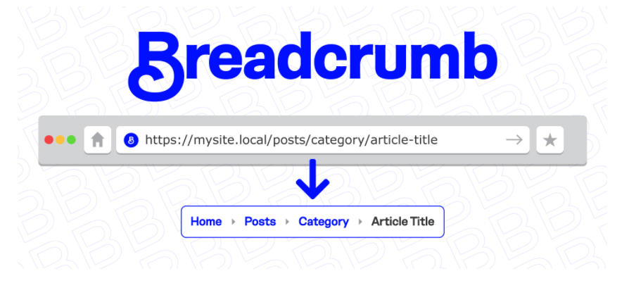
Breadcrumbs are a secondary navigation aid that helps users easily understand their position between their page (such as product page) and top-level pages (such as category page). The word is taken from the story of Hansel and Gretel, where children leave the path of breadcrumbs to find their way.
With breadcrumbs, if you’ve reached a page you do not want to be on, you can easily find your way back or start all over again easily by taking a step or two back.
Breadcrumbs are not just a website-only element. Microsoft also introduced breadcrumb in Windows Vista and has been a feature in every Windows version ever since.
How does a breadcrumb ease navigation?
Using breadcrumbs on Your website eases navigation in a number of ways:

Improves your website search
Peter Morville, one of the founding fathers of information architecture for the World Wide Web, developed the User Experience Honeycomb, which illustrates seven key elements of a great user experience. By helping users easily navigate and find what they are looking for, Breadcrumb can help improve website search.
Encourages browsing and reduces the bounce rate
If the user reaches a product page that they are not interested in, they will bounce back to the category page to restart. Breadcrumbs encourage the user to restart and not bounce. Hull, SS. (2004). Also, learn about Core Web Vitals.
One study found that users who received instructions using breadcrumbs completed tasks faster than users who did not use breadcrumb. For users who access the Internet on a daily basis (even the company’s intranet) using breadcrumbs significantly increases productivity and saves time.
Breadcrumbs offer SEO benefits

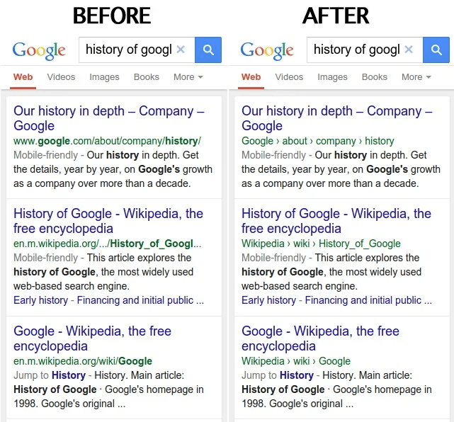
Google has announced that they are replacing URLs with site names and breadcrumb navigation in their search results. This is currently happening for mobile devices and in the coming days, it could also be designed for desktops. Google believes that using a website’s real-world name can help improve usability and show where breadcrumb links take users when they click on a search result.
Webmasters can use schema markup for breadcrumbs to communicate more effectively with search engines. Breadcrumbs have become an additional way to better describe what your pages are to search engines and get a little extra SEO advantage. They also serve as additional links in search results to give you more opportunities for click-throughs.
Breadcrumbs help reduce visitors anxiety

Breadcrumbs can alleviate the visitor or viewer’s anxiety by showing a complete trace of the process of what to expect. For example, By using breadcrumb we can let the customer know how many steps there are in this process and let them go back to the previous steps anytime.
It gives the user an idea of the commitment (time and effort) required to set up the process. Once someone starts trying, such visual cues serve as a strong motivation to end the process.
Types of Breadcrumbs in Website Design
breadcrumbs are basically categorized as of three types:
Breadcrumbs based on location or hierarchy

Location-based breadcrumbs help the user navigate a wider range (top-level pages) from the page they are on. Consider those who search for a pair of desert boots on Google, they will find the search result and be taken to one of your product pages. They don’t like what they see and want to explore other options. How to go back to the main category page (men’s shoes) or subcategory page (men’s shoes - desert shoes)?
With hierarchical breadcrumbs, users can easily see where you are with your site’s architecture and easily go to the top-level page. See how Best Buy does. Learn about XML sitemap.
Path or history-based bread crumb
They offer the same utility as the browser back buttons, allowing the user to return to one of the previous pages they visited. This is useful when the user reaches the product page after applying multiple filters to the category page. With history-based bread crumbs, users can quickly go to one of the previous pages of their journey without leaving any of their options intact.
However, the most common application of history-based breadcrumbs is to use ‘back to results’ links.
Special Attribute breadcrumb

Attribute-based breadcrumb shows only the features selected by the user on a page. Such breadcrumbs find applications on special attribute eCommerce category pages offered by most eCommerce platforms, where users can select features to filter search results.
Because there is no good reason not to use a breadcrumb
Jacob Nielsen has been recommending breadcrumbs since 1995. The reasons are simple.
Breadcrumbs never cause problems in user testing. Consumers only care about breadcrumbs 30% of the time; When they do, it helps and when they don’t, it still doesn’t hurt.
They take up very little space on the page, so real estate may not be the reason you decide not to use breadcrumb.
Breadcrumbs have been very consistent in their appearance over the years. Such a long-term acquaintance is immediately recognizable and therefore useful.
There is a lot of debate over whether to call this function a ‘progress bar’ or a ‘breadcrumb’ navigation. But if popular intelligence allows consumers to go back to the previous step, it’s as good as having breadcrumb. Also, learn what is featured snippet?
Recommended practice to use breadcrumbs

Typically, breadcrumbs appear in a horizontal line, ranging from the user’s top page (home) to the current page. Below is a list of 10 best practices, some of which were recommended by ‘Don’t Make Me Think’ author Steve Krug and Web Design God in their own right.
Always show the full path: reference users. A good breadcrumb trail works like a blinker to focus the customer on work.
Start with the home page: Trails work best when shown a journey from one end to the other. The inclusion of the homepage on the sidewalk acts as a strong anchor, providing a strong orientation to the users.
Use ‘>’ as a separator between levels: it works because it always works. ‘>’ Quickly show the relationship between top-level pages and lower-level pages. Jacob Nielsen initially recommended the use of the colon (:) in the breadcrumb navigation bar. After user testing, they changed their recommendation to use ‘>’ because it conveniently indicates the relationship between high-level pages and low-level pages.
Place the pieces on top: Navigation bars are usually located at the top of the website. Since breadcrumbs act as a secondary navigation aid, they should be placed on top of the content. The Nielsen Norman Group conducted user tests and found that users were expecting breadcrumbs at the top of the page. A good place for breadcrumbs is below the main navigation bar and above the page title.
Show some difference: Contrast bread crumbs stand out as an important activity. Since they take up less space and are mostly text-only, the contrast becomes a key factor to their success.
Use the small type: Using the small type helps to communicate to the user about the relative importance of breadcrumbs in relation to the small navigation bar. It should never be confused with basic navigation assistance.
Make the last item bold: The last item (current page) gives it prominence and informs the user that ‘you are currently here.
Do not hyperlink the last item: Because, why do you hyperlink text on the same page? This is confusing to the user.
Do not use breadcrumbs on the homepage: The homepage is where the user journey begins, there is no point in displaying breadcrumbs on your homepage.
Use Full Page Captions in Breadcrumbs: It makes sense to include full-page titles in breadcrumbs so that users know where each hyperlink leads. But due to long page titles or pages for other reasons, some people prefer to trim page titles using ellipsis (see image below). In such cases, it is best to omit phrases such as ‘you are here’ to make room for more important topics such as the page title.
Hope! You enjoyed reading the content. Don’t forget to share and leave Your valuable comments. Thank You.


3 Comments
win coin dolar
Very nice post. I just stumbled upon your blog and wanted to say that I’ve really enjoyed browsing your blog posts. In any case I’ll be subscribing to your feed and I hope you write again soon!