Eight seconds. It is not very long, but it is the average length of human vision duration. And if you are a marketer who builds a website, it takes the same amount of time to get someone’s attention after your visit. This is not an easy task, but we are going to show you how to do it.
The first impressions are important. If you are losing traffic and your website fails to attract visitor’s attention, your “fold” content may not be sufficiently engaged. Your website may need a facelift to better manage your information and place the most attractive products in the front and center. Most web designers focus their energy on making a website look great, but if it does not attract more readers, you will not see meaningful growth. Moving your content around is the most attractive part of the fold, which helps visitors stay around, subscribe and buy.
Just go through the video below explaining Above the fold from a marketing perspective.
Table of Contents
What does Above the fold mean from a marketing perspective?
What is a “fold” in web design, and why is it so important? If you do not know what “above the fold” means from a marketing perspective, you are not alone. With the wide availability of digital and e-commerce options and the sale of newspapers from newsstands in every corner, the idea goes back to the early days of publication.
Newspapers are folded in half so that only the first half of the first page is visible to passers-by. What they see will catch their attention, or they will stop buying paper. The publishers thus realized that the most compelling headlines had to go “above the fold” to attract the attention of subscribers.
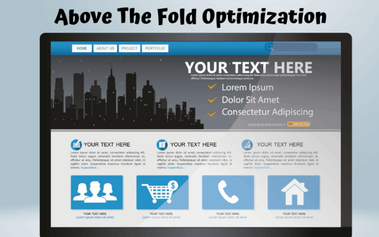
Although the concept of a fold originated long before websites existed, it is still a useful standard for online marketing. The folding top for the website indicates the content that the viewer sees before scrolling down. It’s the main thing that attracts the most attention from your visitors because it’s the first thing they see, so it should attract the reader immediately.
Think about your favorite song. It probably contains some very catchy or interesting opening notes; Otherwise, you will stop listening for the first time. Your top content is the hook of your website, and like any good song, it must be approved by your customer.
Why is Above the fold important?

Content layout and placement are important because the content that appears at the top of the website appears first when the user loads the page. It is the main real state that attracts the most attention from consumers.
Due to its high visibility, you should make it a top priority to achieve your business goals. Content should immediately catch the user’s attention and provide them with the content they are looking for so that they do not bounce back and go to another site.
When it comes to advertising, placing ads on the fold improves their visibility and earns more advertising revenue than ads placed in less visible areas. For BBB websites, placing important call-to-action (CTA) and other important information about the product difference on the homepage or other landing pages usually results in higher conversion rates.
How is Above the fold measured?
It is impossible to define a single fold placement for a website. The exact position of the fold varies due to monitor size (both desktop and laptop), screen resolution, browser plugins, and various phone and tablet sizes.
When determining the average fold placement, most web designers agree that the fold line width is 1,000 pixels and the length 600 pixels. Learn about the Ad unit.
This is the perfect context for the most common monitor/browser combination of 1024×786 pixels, the browser window is maximized and the installed toolbars push no content down.
Your website analysis program can tell your visitors what the most common screen dimensions are. Although 1024×768 is traditionally the most common, new dimensions such as 320×568 and 360×640 are gaining popularity.
Ideas for mobile
The growing use of mobile devices for web browsing has further complicated the concept of optimizing web design on the fold. Learn about mobile marketing.
Mobile devices offer a wide variety of screen sizes. Also, users on the phone usually browse in portrait mode instead of landscape mode, leaving aside the traditional page design.
With so many people accessing web pages in so many different tools, using responsive design in current web design methods: using flexible layouts, images, and cascading style sheets. In reactive design, the page does not have a fixed layout, and the content flows back to any size screen. Responsive web pages respond or “respond” to the environment in which they use or browse.
These days, even though there is a lot of important content on the page, pages should be designed to encourage more scrolling so that they do not lose important content.
Above The Fold best practices
Simple webpage design is a way to attract the attention of your users. If you are new to website design or feel that your site can be reduced to a peg or both, consider these simple guidelines to keep things simple, straightforward, and engaging.
Copy:
Your homepage H1 and tagline should be clear, compelling, and concise. The user should be able to read your header text and know what problem you are solving. Your goal here is to show the customer the importance, and what better way to go through a big, powerful ad on your landing page? “We fix cars” or “Stop worrying about your investment” are two common examples of a header clearly conveying your service.
Once you have given your power statement, create a description showing that the customers have come to the right place. Your top content should echo your brand voice, have a call-to-action and use headlines and copy that your user likes. Keep it consistent and professional and stick to a simple statement that summarizes how your product is their solution.
If you are stuck or can’t find the right words, you may want to check out these tips for creating a clear, compelling, and concise brand message.
CTA:
Tell the customer exactly what you want to do. Your Call to Action (CTA) should be clear and in the upper right corner of your website navigation. It is easy to find and customers will know immediately how to buy your product. Ideally, it is a clickable button or link and prompts people to take action (hence the call to action). Combine the header with a one or two-sentence statement that guides your brand, which will lead customers to the solution. Your call to action should be harsh, inspiring, and unique.
Navigation:
Your content should be easy to interact with and not contain too much information. Think about the user experience and some of the websites you visit frequently that you like. When it comes to navigation, less is more. Your website design should guide your visitors exactly where they want to go. Too many choices in decision-making can lead to fatigue and confusion.
Keep your navigation visible and make sure the menu bar redirects visitors to important pages of your website, such as the page about the product or service you offer, and the contact page with the phone number or email. As a rule, keep your navigation bar at a maximum of 5-7 points.
You also want to address the capabilities and functionality of your website. Faster download or upload speeds and larger bandwidth make it easier for large groups to explore your website at once. If there’s one thing that people hate these days, it’s waiting for the webpage to load. A homepage that takes longer to load can bounce off visitors, so make sure speed optimization is a top priority.
Remove distracting background:

The background video is nice, but is it distracting or amplifying from the copy?
The content “Above The Fold” should not be too busy or distracting. If you have too much at the top of your webpage — text, photos, videos, pop-ups, sales banners — it can be overwhelming for visitors and cause them to click away from your website.
Keep your page organized, simple, and user-friendly. Try using an image, video, or GIF to get things started, and then add a short title to introduce your page and a sentence or two that describes what you have to offer. Explain in detail.
Keep your best content at the top, not your entire message. Try not to push everything down. The idea of Above The Fold is to put all your items on top of your best items. Less is more, so use an attractive image or some clever copy and remove that background distraction to make people scrolling.
SEO ideas
While placing ads on the Above The Fold is often a good practice to increase their visibility, overboard with ads can have negative consequences.
Google has released several algorithmic updates over the years, forcing websites to place multiple ads by forcing the actual content of the page at the bottom of the fold. Sites with a lot of ads at the top of the page offer less experience to users and doing so can drastically reduce free SEO traffic.
Balance is required to optimize ad visibility, thereby maximizing both user experience and ad visibility.
Optimizing content and ad placement
Optimizing site content and advertising placement is a repetitive process that involves data analysis, testing, and experimentation.
A good starting point for page layout optimization is to look at your analysis program to determine your users’ population (browser, screen size, device type) as well as their actual behavior (scroll depth, bounce rate, engagement rate). This analysis gives you baseline metrics to help you find out how your customers are dealing with your site.
After the initial site audit is complete, the next step is hypothesis formulation and testing. You can come up with ideas for content and ad placement, use A/B testing software to place elements on the page, and test what works best.
Once you have that data on hand, you can go back to your analytics data and create new hypotheses to optimize your site.
Hope! You find our information useful. Don’t forget to spread the word and leave comments. And also, suggest any good topic that we should cover. Thank you.


10 Comments
zen
Well! that is some really awesome content. Really nice and informative.
inamdurrani60
Thank You Zen for your response
Samuel
good educating article and the ui of this website is awesome
inamdurrani60
Thanks Samuel for your appreciation
Novella
I am sure this paragraph has touched all the internet people, its really really nice post on building up new web site.
inamdurrani60
Thanks, Novella for appreciating our work
Sheri
I got this site from my pal who shared with me concerning this website and at the moment this time I am
visiting this website and reading very informative articles or
reviews at this place.
inamdurrani60
Thanks Sheri for liking our work